Interviews

Architecture plus Location plus Art | by Alessandra Coppa
Gino Garbellini, an engineer from the Valtellina, plus Francesco Fresa, a Rome native who studied in Berlin, plus Germán Fuenmayor, a Venezuelan architect, plus Milanese architect Monica Tricario equals Piuarch, a practice founded in 1996. Four friends and colleagues who had been working at Vittorio Gregotti’s firm for ten years from the mid-1980s onwards decided to set up their own “design laboratory”, a collective that would embody a new form of “Italian professionalism” and approach to high-quality architecture. Without succumbing to delusions of grandeur, the practice set out to explore a variety of themes and scales of architecture in Italy and abroad while maintaining a special sensitivity towards the location, interaction with art and care for detail.
“Piuarch” stands for openness, for the ability to bring together different approaches and viewpoints in a single project with the contribution of consultants from different fields.
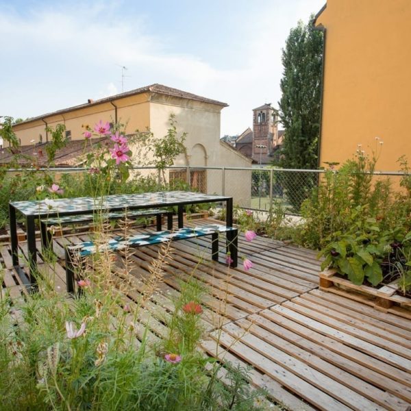
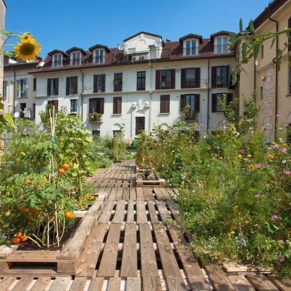
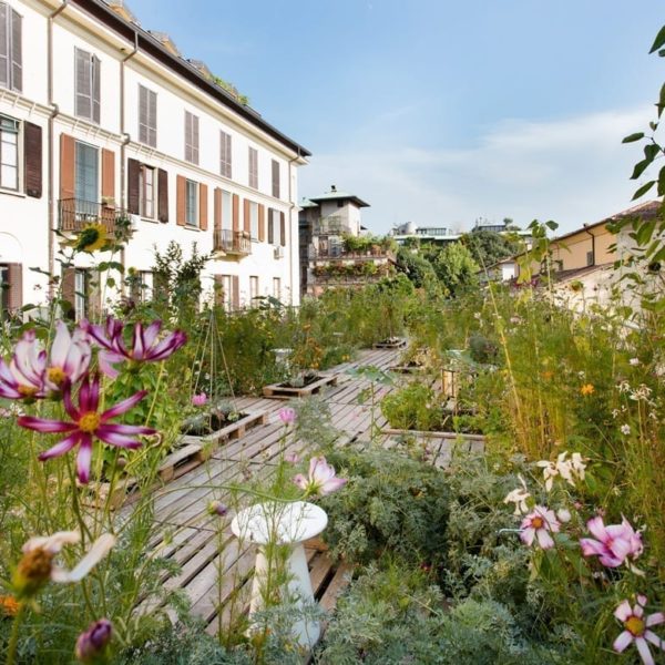
The studio, an open space converted from an industrial building that once housed a printworks with a rooftop vegetable garden, is located in Via Palermo, in the heart of Milan’s Brera District.
You first met while working at Gregotti’s practice. What legacy has this experience left and how have you organised the way you work together since then?
The legacy of our experience working for Gregotti certainly remains, but it’s not a heavy burden. The positive aspect is that it gave me the opportunity to meet my partners. The experience was a kind of emancipation, a useful part of our training that we were easily able to leave behind. It was important for developing our ability to work on all scales of architecture. There was a lot of work to do and as young architects we were thrown in at the deep end. We worked together and identified as a group.
Did you work as a group under Gregotti?
At Gregotti’s practice we tended to work under his guidance rather than as a group. By contrast, at our practice we operate as a collective and avoid dividing up roles. We work without rules and complement each other very well. We emerged from the experience with a desire to look forwards and to do something new but without forgetting where we came from.
Could you tell us about the first project you completed, the social housing development in the former Falck area in Sesto San Giovanni, and your latest project, the Gucci headquarters in Via Mecenate in Milan? What aspects have remained the same and what has changed in your design approach?
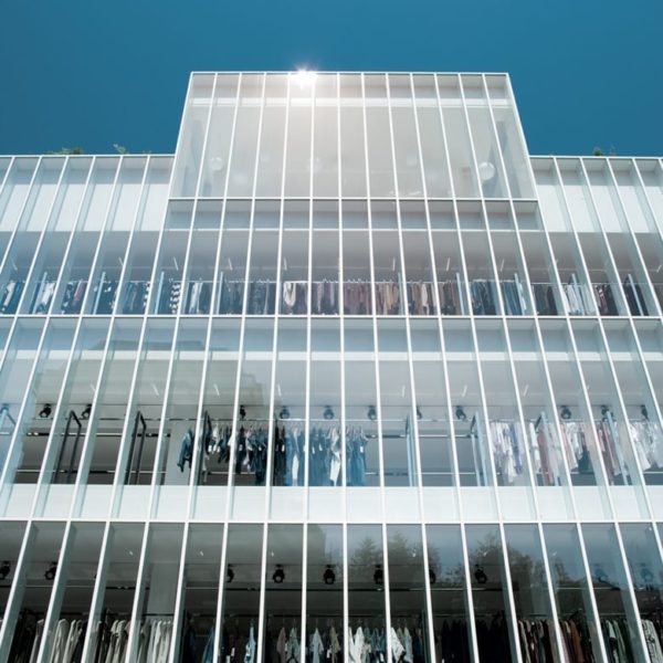
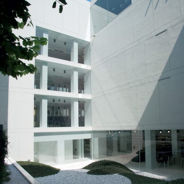
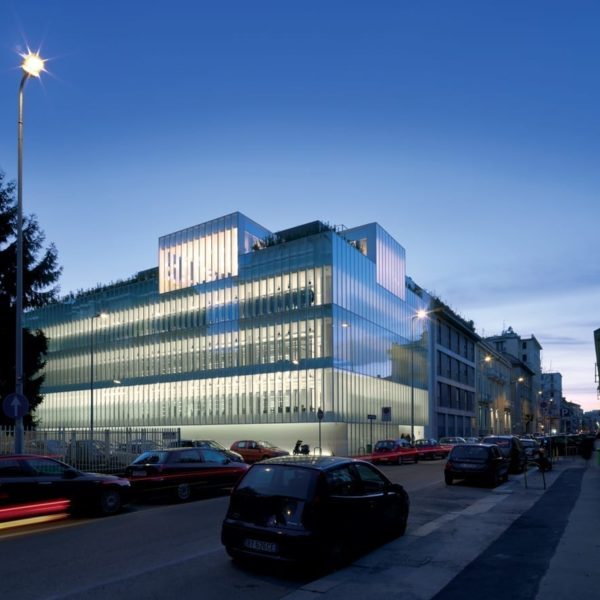
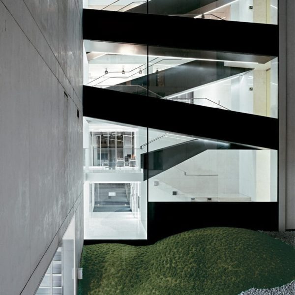
Our first project, the Fola subsidised housing complex in Sesto San Giovanni, was an extraordinary experience that will always remain in our hearts. It was an important theme in those years because people were trying hard to create good-quality social housing with experimental use of wood. We were young and our references quoted Terragni. Although rather scholastic in terms of its design, the project was also sophisticated and attentive to detail. Our latest project is the Gucci headquarters in Via Mecenate. It differs from our first project not only in its scale but also in its ability to explore detail not for its own sake but as part of a whole. The building is envisaged as a kind of organism: here detail is much more complex because the new interacts with industrial architecture.
Luca Molinari has written that entering the world of Piuarch means “stepping into an unusual dimension of Italian professionalism and a new and growing practice”…
We’re celebrating our twentieth anniversary this year, which is an important milestone and a splendid tribute to our multi-professionalism. It’s the kind of professionalism that shuns today’s attention seeking and obsession with celebrity and instead prefers to focus on accomplishments and completed projects. We believe this has greater value as a form of communication. The very fact that we are not named after a person emphasises the idea of a whole, of an assemblage, while the openness conveyed by the Italian word “più” (meaning “plus” or “more”) underscores the concept of bringing people together and being open to external consultations.
It seems to me that you think of and create architecture independently of styles and languages, placing “quality” and dialogue with the “location” at the centre of the project.
A dialogue with the site where the project is to be carried out is certainly crucial for our work.
It’s a kind of boundary condition. The first thing you do when you’re in a new place is look around. And what you see around you gives you ideas, it provides inputs. But I believe that the context is not limited to the site itself, it includes things that cannot be seen, the “culture” of the place you’re in. Art too is part of the context and is an integral part of our work. It’s both a physical and a perceptive context, which for me has the significance of “fusion”.
I’d like to discuss your projects through keywords: filters/façade, basic/materials, luxury/detail, courtyards/urban space, city/landscape. Can you associate these concepts with a building you have created?
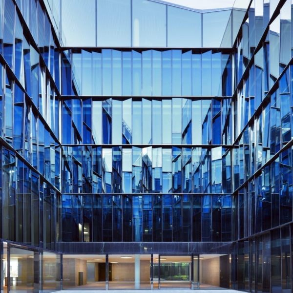
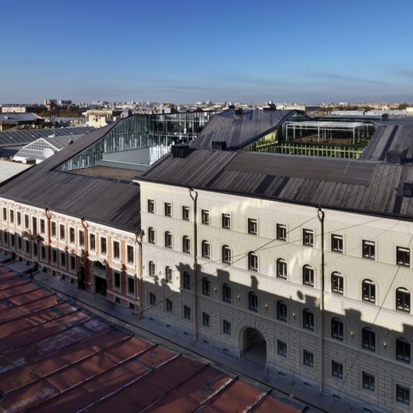
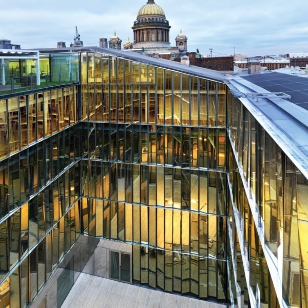
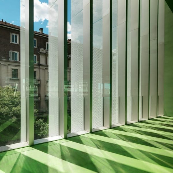
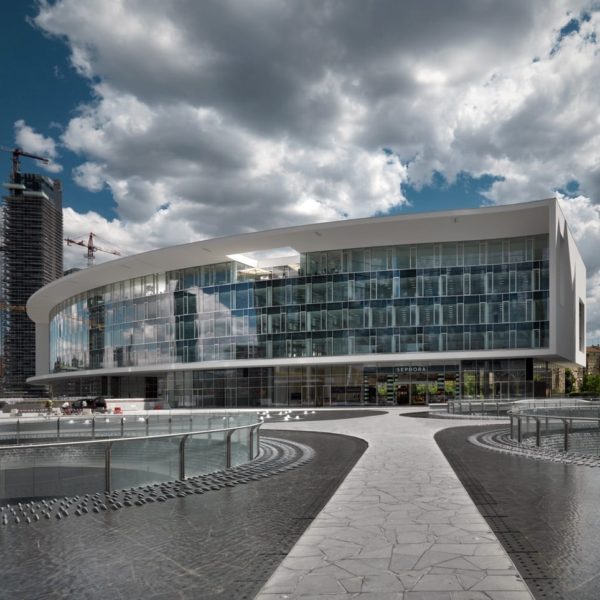
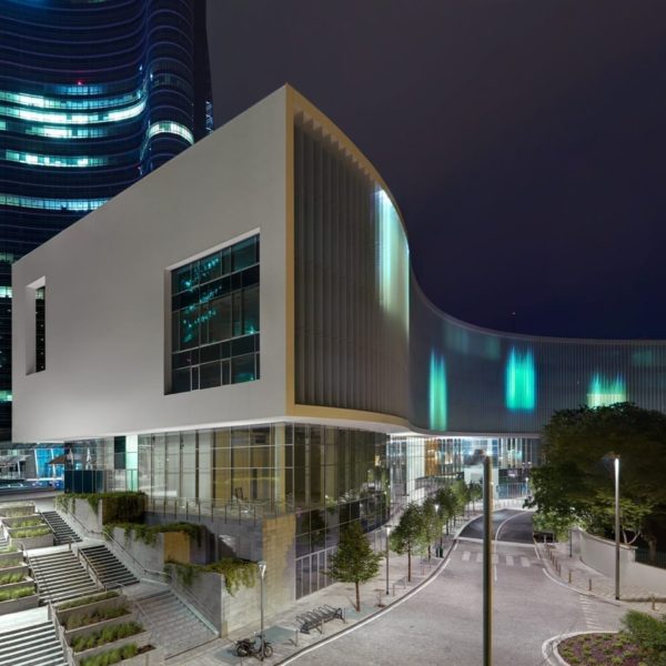
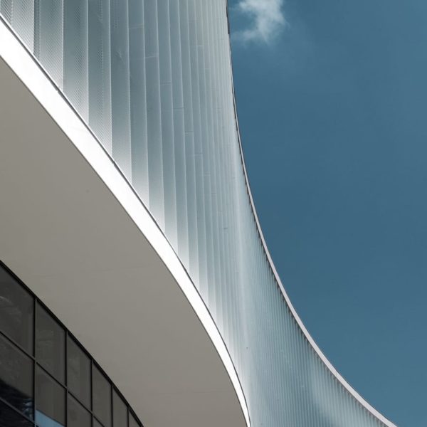
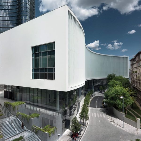
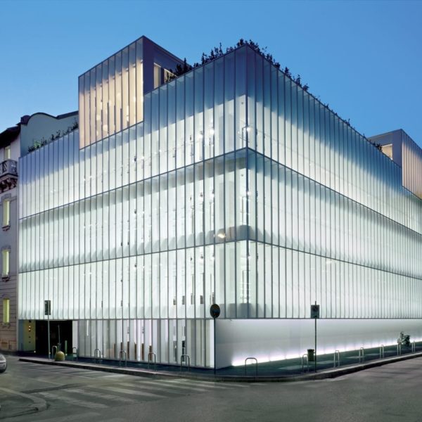
I’d associate “filters/façade” with the Bentini headquarters (Faenza, Ravenna 2009-2011) because in this case the context is nothingness, a fairly nondescript countryside viewed through “filters” in the form of large rectangular compartments that bring the outside inside, framing it. For “basic/materials” I would say the Porta Nuova building in Milan because it has a white framework, a colour that lends a sense of uniformity to the project. Simply by using plaster for the façade we were able to achieve a kind of abstraction. Material emphasises form. The theme of luxury/detail applies to all the buildings we have designed for the world of fashion, where the architecture is the sum of the details. For “courtyards/urban”, I would choose the Quattro Corti Business Centre in the city of St. Petersburg. It is a building that maintains the historic façades, inside which we created four courtyards to illuminate the interior spaces. These courtyards serve as meeting places and are used to host art installations, exhibitions and other initiatives open to the public. For “city/landscape” I would say the project for Riva del Garda, which is still under construction, because the complex dialogues with the lake and the mountain.
For Dolce & Gabbana you designed the Milan headquarters in 2006 and five years earlier the Incisa factory in Val d’Arno. What kind of relationship did you have with the client?
It was a great opportunity for us to grow through involvement in high-quality projects. Relations with Dolce & Gabbana were difficult because the client was very demanding. There were conflicts between our respective visions of the project as the client wanted an architecture that would reflect its approach to fashion.
You also designed the building you mentioned earlier in Piazza Gae Aulenti in Milan Porta Nuova, which occupies a difficult position due to its role as an “urban connecting area”.…
We wanted to break the rules imposed by the masterplan, as it tended to close off the views and focus attention on the square. We opted for a low building, in contrast to the brief which specified a tall one. It has the same height as the historic buildings in the neighbourhood and connects the closed, introverted square with the overhead walkway that crosses Via Gioia in the direction of Piazza della Repubblica and the future park.
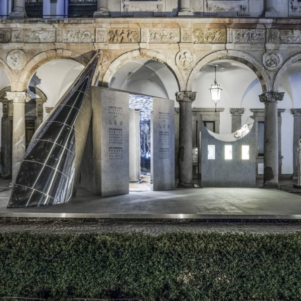
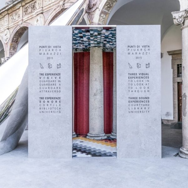
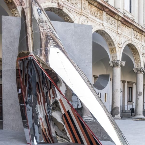
For the Salone 2015, you created an installation for Interni in the courtyard of the University of Milan that displays an interesting interaction between ceramics and architecture.
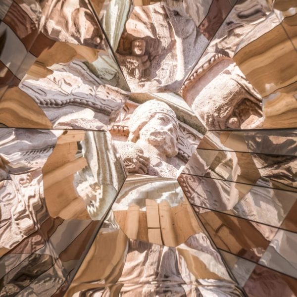
We thought of an installation that would use the tiles we created for Marazzi and a design that references Gio Ponti. The same tiles are used to generate different geometries. The idea was to use them to create a play of reflections that would highlight certain architectural elements of the university. The installation was called Punti di Vista (Points of View) and aimed to stimulate thought about the architectural characteristics of the context. The classic elements of the university’s architecture – the frieze, column and arch – were broken down into pure geometric figures which in turn generated an interactive space. The three architectural forms, clad with Mystone porcelain from Marazzi, allowed visitors to look ‘in’, look ‘towards’ and look ‘through’. When approaching and entering the structures, visitors could enjoy an experience of reflection and vision, from total immersion through to kaleidoscopic effects.
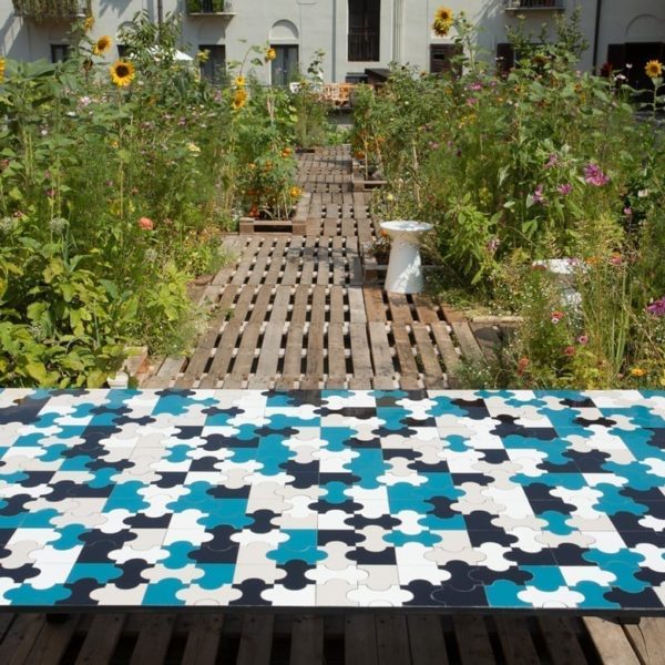
Are they the same tiles that are used on the table top located in the vegetable garden above your studio?
That’s right. The initiative entitled “Orto tra i cortili” (“Courtyard garden”) was primarily aimed at enhancing the quality of the roof space above our studio.
Is this a metaphor for nature-architecture?
I see nature as another factor that influences our work. It’s a possibility rather than a priority, it’s something that belongs to me. The garden helps us design and work together.


