Products Trends


The hi-tech and low-tech bathroom trends | by Luisa Pianzola
Bathrooms are becoming increasingly hi-tech, incorporating technology that is so advanced that it is actually invisible. And although smart technology is being adopted throughout the home, it’s in the bathroom – the space devoted to everyday wellness – that the trend is most evident. Hi-tech bathroom devices include whirlpool baths and multifunctional shower cabins for chromotherapy, music therapy and aromatherapy, luminous shower heads with waterfall jets, low-consumption radiators, integrated systems with steam baths and saunas, endless pools for counter-current swimming, high-performance solid surface materials, heating mirrors and body-analysing toilets.
Ultra-customised wellness
Another major bathroom trend is that of home automation, an eco-sustainable and constantly evolving technology that allows water temperature, climate and other functions to be programmed directly from a smartphone or a touchscreen video system. But as a reaction to this pervasive technological presence – albeit one that is virtually invisible and easy to use – another trend is now making headway in the design and furnishing sector. This is the low-tech movement, which embraces simplicity and has evolved progressively in step with the inexorable advance of technology.
But let’s look back a few decades.
In the early days of wellness, the bathroom was not so friendly
In the beginning, technology was neither invisible nor easy to use. Some of us may remember just how unfriendly the first whirlpool tubs were back in the early 1990s, in many cases showy status symbols installed in cold, impersonal bathrooms whose shiny surfaces were completely out of keeping with the rest of the home. The intimidating operating panels clustered on the edges of the whirlpool tubs and shower columns were already prompting a rejection of all those buttons and a yearning for the simplicity of the old-style bathtub. Sure enough, this anti-technological trend was not long coming, and for a while at least whirlpool tubs vanished from our bathrooms. The room devoted to well-being began its process of transformation, evolving from an ultra-technical, showy space into today’s intimate and reassuring environment, where the desire for a simple, shared everyday lifestyle is reflected in surfaces, colours and furnishings that are in perfect harmony with the rest of the home.
The triumph of low tech
During that period, technology was decidedly out of vogue and bubbling whirlpool tubs were nowhere to be seen. This was the heyday of the low-tech design movement spearheaded by the Dutch design firm Droog Design, renowned for its brilliant creativity that combined pragmatism, arte povera and conceptual art. Meanwhile, the concept of wellness was gaining ground in comfortable new spas (an acronym for “salus per aquam”) redesigned with younger users in mind. In short, home wellness could wait!
Advanced (but discreet) functions make a comeback
Recently we have begun to see yet another change, a shift towards user-friendly digital technology and advanced but simple-to-use functions, as well as ease of cleaning and maintenance. And whirlpools, along with other wellness devices, are making a big return even in the home.
But tastes have changed and once simplicity has been rediscovered there’s no going back. Relaxation and psychophysical regeneration call for calm movements, harmonious forms and colours, emotional choices inspired by the concept of “less is more”. Paradoxically, however, the fact that technology is so advanced means that its physical presence is almost entirely eliminated, freeing the wellness space from the need to reveal its now outdated functional role.
Once simplicity has been rediscovered, there’s no turning back
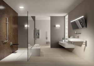
Excessive technology, unnecessary frills and superfluous decorations are being replaced by essential, matt and soft-touch surfaces; serial furnishing systems that integrate solid surfaces with reclaimed wood; natural finishes and colours; the inclusion of objects and accessories that are not specifically designed for the bathroom; compact and organic forms and volumes; a return to neo-industrial solutions such as painted steel washbasins and light perforated metal tops. In short, everything is simple, basic and low profile. And of course sophisticated.
- 1_CRISTINA RUBINETTERIE
- 2_BIANCHINI & CAPPONI
- 3_MOMA DESIGN
- 4_ARBLU
- 5_PBA
- 6_SAMO
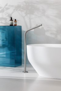
1_Made of stainless steel and ideal for residential and contract furnishing applications, the new SX series designed by Makio Hasuike & Co. for Cristina Rubinetterie has a soft, tapered silhouette and a unique conical bevel that conceals the aerator. The series includes versions for freestanding and countertop washbasins, freestanding bathtubs and shower columns, available with wall or surface-mounted controls.
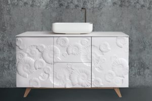
2_The Ammoniti bathroom vanity unit from Bianchini & Capponi is made of Stonelight (like the countertop and washbasin) with fossil-shaped carvings. The interiors are made of natural oak. Both doors and drawers are equipped with a push system.
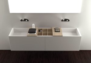
3_Canasta, from Moma Design, is a double washbasin vanity top. In the middle, a teak storage compartment is hidden by two sliding shelves. The entire unit is housed in a matt white lacquered cabinet with invisible handles.
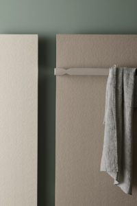
4_The sensation of natural stone makes the Trendy radiating panel the perfect compromise for those who want a simple object but with a well-defined character
(by Arblu brand Livingstone).
5_400-ALU is the ultimate evolution of PBA’s series of supports, complements and accessories for the bathroom. After using stainless steel, resin and copper, the line conceived for healthcare facilities exploits the appeal of aluminium to expand its application potential.
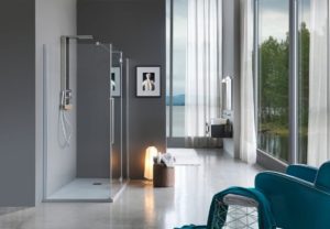
6_Zenith, from the Eccelsa collection by Samo, is a minimalist shower cubicle with articulated and liftable hinge with a steel body and polished chrome casing, glass-mounted magnetic seals, chrome-plated arm or support kit. The door opening system allows for 90° inward and outward rotation of the hinges.
November 2018


